Your Cart is Empty
Add description, images, menus and links to your mega menu
A column with no settings can be used as a spacer
Link to your collections, sales and even external links
Add up to five columns
Add description, images, menus and links to your mega menu
A column with no settings can be used as a spacer
Link to your collections, sales and even external links
Add up to five columns

2 min read
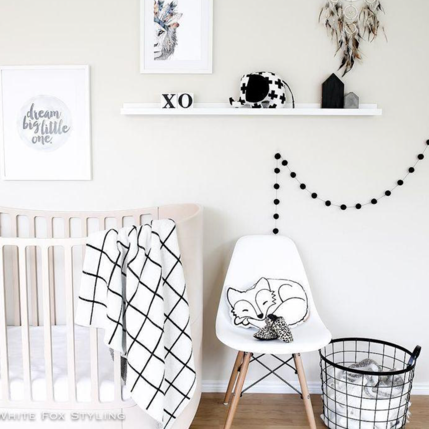
Monochrome hits the trend radar every few years in fashion and interior design and nurseries are increasingly being decorated in this timeless colour scheme.
Many may feel a monochrome scheme is too harsh for a baby but this needn't be the case. As some of the best designers around have embraced the trend there are now a huge variety of products in black & white that are designed specifically for children. So you can have that woodland theme and a monochrome palette. If you want to soften the look, use off-whites or add a muted colour such as dusty pink or taupe.
But monochrome nurseries aren't just about style. Babies only see in black, white and grey for the first four months of their lives and research has shown that black and white contrasts register powerfully on a baby's retina and send the strongest visual signals to their brains. Stronger signals mean more brain growth and faster visual development. So a monochrome theme will not only result in a stylish nursery but will actually benefit your newborn!

The neutrality of a monochrome scheme gives you the power to add splashes of colour when you (or they) fancy a change. You can add colour in the form of a new cushion, rug or lampshade. It's possible to repeatedly update a monochrome scheme in this way as your child grows without an entire room makeover.
Monochrome also replaces the traditional lemon yellow for parents who don't want to know the gender of their baby until it's born. You can buy all of the key items in black and white and add colour at a later stage.

As far as pattern is concerned, keep it simple. A patterned statement wall and several soft furnishings work well. If mixing various patterns try playing around with scale - large stripes teamed with a small polka dot pattern for example. This way the patterns won't compete with each other or make a room look too busy.
Simple, graphic designs work well – stars, clouds and raindrops are recurring themes. There are many stylish graphic prints available that look great in a contemporary nursery and won't date as your child grows.

Monochrome nurseries are a trend that is here to stay. Done well, they make inspiring spaces for little ones and fit perfectly into stylish contemporary homes. You can design a nursery knowing that many of the pieces will see your little one from newborn to toddler and well beyond.
Why fabric wall stickers? Most stickers are made from vinyl, a highly toxic plastic ... READ MORE
Sign up to get the latest on sales, new releases and more …